The Pareto Principle was named after an Italian economist who discovered that 80% of the wealth in Europe was concentrated in 20% of the population. This discovery is also known as the 80/20 rule or the Law of the Vital Few. The Pareto Principle is a phenomenon that finds application in many places, such as software engineering, quality, manufacturing, word-of-mouth marketing, human resources, and government; the 80/20 rule was also popularized by the book “The Mckinsey Way” as a principle by which Mckinsey consultants follow to solve client problems.
The excel tutorial and the 4:48 minute HD video below shows the history of the Pareto Principle, when to use it, how to use it to show us where to focus our Lean and Six Sigma efforts.
A result of the Pareto Principle is the Pareto Chart. The Pareto Chart is used to graphically summarize and display the relative importance of the differences between groups of data, or to visually represent the Vital Few versus the Trivial Many.
You can create a Pareto Chart in any statistical tool such as GNU Plot, MatLab, Mathematica, Stata, SAS, or MiniTab. For our example, I’ll show how to create a Pareto Chart in Excel.
To create a Pareto Chart in Excel, setup a spreadsheet such that the first column contains the categories of your data, the second columns, percentages of each category, and the third column cumulative percentages of each category. The example below represents data collected on the number of citations issued by police for various violations (Category) in a particular intersection. Overall, 300 tickets were issued for various traffic violations. The percentage of tickets issued for each violation and the cumulative percentage of tickets issued were calculated and entered into an Excel spreadsheet. If the data is not sorted from high to low, then sort the data from the highest percentage to the lowest. The sequence for sorting is Data, Sort, Percent, Descending.

Then, highlight Categories, Percent, and Cumulative Percent Columns. Go to the Chart Wizard, select Custom Types and select Line-Columns.

In my line of work, I use the Pareto Principle all the time. As an example, at Amazon, I used the Pareto Principle to separate the value-added time in a process versus the non-value added time. This approach would help direct efforts on where to spend our time to improve a process. The Pareto Chart is a nice and easy way to visually display the data and direct efforts.
In software engineering, to avoid feature creep and to remain focused on the right features, it’s important to use the Pareto Principle to determine which 20% of the features will satisfy at least 80% of the users. In my experience, not enough software organizations use this principle in their software development.
In Human Resources, roughly 20% of the people produce 80% of the results.
In Government, roughly 20% of the group are influential and the other 80% are peripheral.
In word-of-mouth marketing or marketing in general, roughly 20% are the influential, “sneezer” types and the remaining 80% are the slow adopters or followers.
In Project Management, if a schedule slips or a milestone is not met, it must be measured against the 80/20 rule and then quickly recover the project and re-focus on the vital 20%; or, make sure that the milestone kept are part of the vital 20% and if a milestone under the trivial 80% slips, then the team can afford to do that and not freak out that the project will fail.
To apply the Pareto Principle more broadly, as a general rule, it’s important to remember that only 20% of our daily activities matter. Or, put another way, let us focus our energies and time on the 20% that will make an impact on the other 80%.
| Blog Article | Excel | PowerPoint | Video |
| Module | Description | Type | |
| Overview |
What is Six SigmaThe various definitions of Six Sigma is explained in this 5:42 video. We specifically discuss 6 definitions of "Sigma", ending with the most relevant definition which is related to the DMAIC Method of Problem Solving. |
||
| Overview |
The DMAIC FrameworkIn this 4:17 video, we explain the DMAIC framework and give an introduction to each phase in DMAIC. We specifically show the storyboard for each phase in the DMAIC framework. |
||
| Overview |
DMAIC versus PDCAArticle describes how PDCA is used in Lean and the similarities and common history between PDCA and DMAIC. |
||
| Overview |
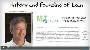
History of Six Sigma and LeanIn this video, we go through the various contributors of Six Sigma, their contribution, and why it's important in the practice of modern Six Sigma. We also go into the history of the Toyota Production System and how the term "lean" was coined. Video is 7:36 long. |
 |
|
| Overview |
Lean History and TimelineThis article shows a comprehensive history and timeline of Lean and of continuous improvement beginning in the 1600's. |
||
| Overview |
Black Belt CertificationIn this article, we provide various resources where you may take the Black Belt exam should you choose to do so. We also discuss the positive and negative of Black Belt certification. |
||
| DEFINE | |||
| Define |
The Define Phase StoryboardWe introduce the Define Phase and show the Define Storyboard, a high level map of what the phase is about and the expected outputs. Video length is 3:50. |
||
| Define |
Business Needs AssessmentIn this video, we discuss how to identify business needs of an organization and how to take that knowledge and transform it into a formal DMAIC project that will get the backing and support from top management. Video length is 6:46. |
||
| Define |
Project CharterIn this 5:37 minute video, we explain the role of the project charter and its importance in Six Sigma DMAIC projects. Video length is 5:37. |
||
| Define |
Project Selection MatrixIn this short 2:51 minute video, we learn a simple and effective method for prioritizing between competing priorities. This method is important for the selection of an improvement project. |
||
| Define |
Problem StatementArticulating the problem well gets you much closer to a solution. In this video, we show you how along with several real world examples of effective problem statements. Video length is 5:42. |
||
| Define |
Stakeholder AnalysisIdentifying stakeholders and their needs is one of the most important steps in Define. This is especially crucial if there are any influential stakeholders that are resistant to your message. Video length is 2:47. |
||
| Define |
Affinity DiagramAffinity Diagram is a tried and true method for brainstorming and coming up with ideas. Learn how to apply this technique in this video. Video length is 4:25. |
||
| Define |
SIPOCIdentifying the key spots where measurements can be taken in crucial. This video will show you how to do it. Video length is 3:01. |
||
| Define |
Voice of the Customer and CTQIn this video spanning 5:11, we explain Voice of the Customer and how Six Sigma is rooted in the customer. We explain how to translate Voice of the Customer into Critical to Quality Metrics. |
||
| Define |
Critical to Quality TreeArticle explaining the critical to quality tree, with examples, and a template to download so you can create your own for your six sigma projects. |
||
| Define |
Value Stream MapIn this 4:42 video, you will learn understand the value stream map symbols and learn how to design your own value stream map. We provide a zip file of VSM Symbols for you to download. |
||
| Define |
Kano ModelWe explain the Kano Model to identify service and product characteristics that should be "satisfiers" and the ones that be "good enough" and don't need to go any further. |
||
| MEASURE | |||
| Measure |
The Measure Phase StoryboardWe introduce the Measure Phase and show the Measure Storyboard, a high level map of what the phase is about and the expected outputs. |
||
| Measure |
Data Types in Six SigmaIn this article we explain the various types of data, how they're different, and what they tell us about process behavior. We will also learn how to collect data. Video length is 5:24. |
||
| Measure |
Descriptive StatisticsIn this module we learn various data measures that tell us key characteristics of a data set. We also begin the foundation for our discussion on distributions in a later module. |
||
| Measure |
DistributionsThis is a brief introduction to statistical distributions and what inferences we can draw from them. |
||
| Measure |
Graphical Representation of DataGraphically representing data effectively is required to effectively communicate meaning. In this module we learn various graphical methods and how to do them. |
||
| Measure |
7 Quality ToolsWe briefly introduce each of the 7 quality tools. We follow this video several videos where we focus on the detailed of each of the 7 quality tools. Video length is 4:46. |
||
| Measure |
Check SheetsIn this HD video, we explain the checksheet, what it is used for, see various examples of checksheets, how to create one, and be able to download a checksheet template from the Shmula content library. Video length is 3:53. |
||
| Measure |
Pareto ChartIn this 4:48 minute video, you will learn the history of the Pareto Principle, why it's important, and how to apply the Pareto Principle in your lean and six sigma efforts using excel. |
||
| Measure |
HistogramThis video on the Histogram explains what it is, when to use it, and how to use it. Video length is 3:01. |
||
| Measure |
Scatter PlotIn this 4:27 short video, we introduce the Scatterplot, what it is, why use it, and how it can be helpful in your six sigma projects. |
||
| Measure |
Cause and Effect DiagramThis 5:21 minute video explains the cause and effect diagram - what it is, when to use it, and how to create one. |
||
| Measure |
Control ChartIn this video, we introduce you to the control chart - what it is, where to use it, when to use it, and how it's used. Video length is 7:05. |
||
| Measure |
Run ChartIn Progress |
In Progress | |
| Measure |
Process Cycle EfficiencyProcess Cycle Efficiency is a more modern tool that looks at processes from the perspective of value and waste. We show you how to do it and why it's important. |
In Progress | |
| Measure |
FMEAFailure Mode Effects Analysis is a tried and true method and technique for quickly identifying ways where process problems can occur and how to quickly mitigate them. Video length is 4:45. |
||
| Measure |
Basic StatisticsIn this article, we go in depth to explain basic data types, scales, and the language of six sigma. |
||
| Measure |
Using Z ValuesWe learn about Z Values or the Z Score with applications in Six Sigma projects. |
||
| Measure |
Sample Size CalculationsIn this module we learn the underpinnings of sample size calculations and how they are used in six sigma. We provide a sample size calculator in the template section also. |
||
| Measure |
Introduction to VariationThis article introduces the learner to the concept of variation and how it impacts the customer experience. |
||
| Measure |
Red Bead Experiment Part 1Introduction to red bead experiment. |
 |
|
| Measure |
Red Bead Experiment Part 2In part 2, we actually do a quick run through the experiment. |
 |
|
| Measure |
Red Bead Experiment Part 3In this video, we explain and go through more runs of the experiment. |
 |
|
| Measure |
Red Bead Experiment Part 4In this video we continue our experiment and go through some of Dr. Deming's most famous quotes. |
 |
|
| Measure |
Red Bead Experiment Part 5Continuing the experiment, with a focus on how to best facilitate an event. |
 |
|
| Measure |
Red Bead Experiment Part 6In this last video in the series, we go through the key lessons learned from Deming's famous experiment on variation. |
 |
|
| Measure |
Measurement System AnalysisIn this video we discuss variation and how it impacts our methods of measuring. Video length is 5:28 and we show examples along with tips on how to deal with bad metrology. Video length is 5:28. |
||
| Measure |
Gauge R&RIn this video we explain the Gauge R&R Test and provide various examples of where and how it may be applied in industry. |
In Progress | |
| ANALYZE | |||
| Analyze |
The Analyze Phase StoryboardWe introduce the Analyze Phase and show the Analyze Storyboard, a high level map of what the phase is about and the expected outputs. |
In Progress | |
| Analyze |
BrainstormingWe introduce various methods of brainstorming. Some conventional and some not very and more modern. Some of these methods are taken from Design Thinking and have been found to be very effective in identifying innovative and simple solutions to problems. |
In Progress | |
| Analyze |
5 Whys and Fishbone DiagramIn this video we explain the 5 Why exercise and show many examples. We extend the 5 Whys and show how it naturally leads to the Fishbone Diagram. |
In Progress | |
| Analyze |
Verifying Root CausesWe introduce hypothesis testing and various methods for doing so including the Regression, T Test, Chi Square, and ANOVA. |
In Progress | |
| Analyze |
Hypothesis TestingIn Progress |
In Progress | |
| Analyze |
RegressionIn Progress |
In Progress | |
| Analyze |
T TestIn Progress |
In Progress | |
| Analyze |
Chi SquareIn Progress |
In Progress | |
| Analyze |
ANOVAIn Progress |
In Progress | |
| IMPROVE | |||
| Improve |
The Improve Phase StoryboardWe introduce the Improve Phase and show the Improve Storyboard, a high level map of what the phase is about and the expected outputs. |
In Progress | |
| Improve |
Change ManagementWe introduce you to several change management models that have been found to effective in practice. We show what they are, how to do them. |
In Progress | |
| Improve |
Solution Selection MatrixThe Solution Selection Matrix is a simple tool that helps a team vote and decide on which solution makes the most sense to put resources behind in improvement projects. |
In Progress | |
| Improve |
Process CapabilityWe discuss process capability and how it's different from a process not in control. We discuss its importance. |
In Progress | |
| Improve |
Cost / Benefit AnalysisWe introduce the concept of Cost and Benefit Analysis and provide several ways at showing cost savings from Six Sigma Projects. |
In Progress | |
| Improve |
Poka YokeAs part of the Improve Phase, we introduce the concept of Poka Yoke, or error proofing, as a way to prevent defects before they even occur. We show may examples and teach the principles behind Poka Yoke. |
In Progress | |
| CONTROL | |||
| Control |
The Control Phase StoryboardWe introduce the Control Phase and show the Control Storyboard, a high level map of what the phase is about and the expected outputs. |
N/AN/A | |
| Control |
Before / After ParetoWe show ways to visually see before and after results of your project. |
In Progress | |
| Control |
Standard Pig GameIn this 4:55 minute video, we show you a simple and effective game that teaches the importance of Standard Work. This video should be watched prior to the video on Standard Work. |
||
| Control |
Standard WorkStandard Work is a foundation of Lean and Six Sigma. In this 5:36 minute video we explain Standard Work and show its role in continuous improvement. |
||
| Control |
Control ChartsWe discuss the various control charts, why they're important, and how to create them given your process and given your data type. |
In Progress | |
Become a Lean Six Sigma professional today!
Start your learning journey with Lean Six Sigma White Belt at NO COST


